The news about iTunes cancellation has, on one hand, been a surprise for many. Some, on the other hand, saw it coming much earlier, indicating the apparent problems that the app’s users had to struggle with for years.
So, while some are already missing the old platform and others think its dismissal to be for goo, the question still stands. Are the new standalone apps objectively better than iTunes?
To answer this, let's take a look at the reasons for iTunes’ cancellation and examine technical problems that led to this decision. Obviously, the issues with the app itself might have not necessarily played a significant role in this decision - marketing goals are not to be ignored either. So, in itself, the fact of iTunes cancellation doesn’t mean that the platform was in that much of a crisis.
Before we delve into the analysis, let us reassure you. iTunes is not completely dead. It’s still working on Windows PCs. As we’ll see later on, there are a lot of compelling users to keep using the platform in its original version. Windows users can still install an iTunes download free and enjoy the original experience.
Now, let’s cut back to the chase.
Then, he made a joke about adding a mailing client to iTunes as well, to illustrate how unrealistic user expectations are. So, this is the main reason why the company decided to split iTunes up. The growing complexity prevented the program from delivering the best user experience and mad technical maintenance much harder.
If you were using iTunes from its earliest periods, you perhaps can’t fully understand just how over-equipped the software has become in 18 years. Look at the list of the most significant changes of iTunes. Keep in mind that each of those significantly altered its functionality and interface.
If you used iTunes in those earliest days, you recognized that it was simple, but you probably did not recognize how much more complex it became. Since Apple added in features more or less one at a time, its complexity crept up on you.

Now iTunes is a jack-of-all-trades, specializing in music, film, TV, podcasts, device synchronization, CD ripping, music sharing, and ringtone making. Apart from some failed projects (like Ping, a closed social networks for musicians), Apple was successful in its each iTunes update.
However, it’s the bigger picture that was the problem. It was remotely easy to carry on with updates if you are an experienced user. For new Apple users, it was overwhelming, to say the least. The functionality was just too much to understand. To perform a simple setting, you have to go through dozens of tabs.
So, the main issues of all-in-one iTunes were the following:
You see clear reports on what podcasts you rented and when, and keep all the subscriptions and downloads in check on a single tab.
However, dismissing iTunes as outdated or problematic is just wrong. For one thing, having all features available in one app is more comfortable than having to switch from one solution to another constantly. Also, so far, new apps don’t offer quite similarly rich user experiences. While simplicity is faster and more comfortable, complexity provided more options.
Luckily, the old platform is still available for Windows. If you feel nostalgic about the old platform, you can get the old feel on the Windows PC.
Let’s hope that developers, caught up in new apps, won’t abandon the Windows version. It would be a shame, considering that its recent updates were truly decent. In any case, old iTunes remains quite relevant, and new apps show a lot of promise. We’d say this is all good news.

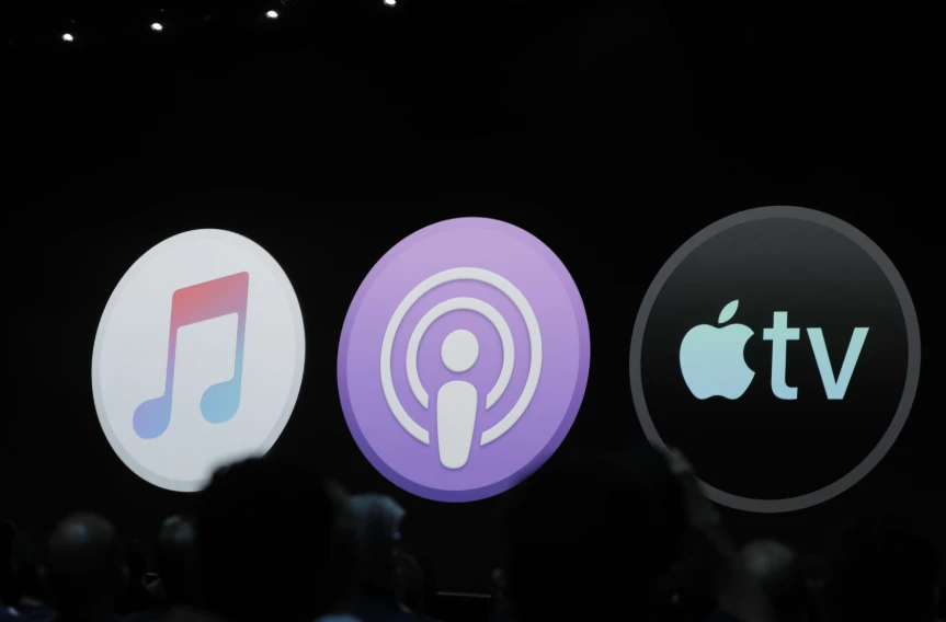
In June, Apple presented three new apps instead of good old iTunes
So, while some are already missing the old platform and others think its dismissal to be for goo, the question still stands. Are the new standalone apps objectively better than iTunes?
To answer this, let's take a look at the reasons for iTunes’ cancellation and examine technical problems that led to this decision. Obviously, the issues with the app itself might have not necessarily played a significant role in this decision - marketing goals are not to be ignored either. So, in itself, the fact of iTunes cancellation doesn’t mean that the platform was in that much of a crisis.
Before we delve into the analysis, let us reassure you. iTunes is not completely dead. It’s still working on Windows PCs. As we’ll see later on, there are a lot of compelling users to keep using the platform in its original version. Windows users can still install an iTunes download free and enjoy the original experience.
Now, let’s cut back to the chase.
Then, what was wrong with iTunes?
Craig Federighi, Apple VP of Software Engineering, put this well at the Worldwide Developer Conference - the very same event where the demise of iTunes was first announced. People love everything iTunes does, he said and added that they keep wondering when will the platform be capable of doing more.Then, he made a joke about adding a mailing client to iTunes as well, to illustrate how unrealistic user expectations are. So, this is the main reason why the company decided to split iTunes up. The growing complexity prevented the program from delivering the best user experience and mad technical maintenance much harder.
I am going to miss my iTunes
While some people cheered for iTunes demise, others got very upset. How could an iconic solution that revolutionized musical industry be split up? The truth is, we indeed saw this decision coming.If you were using iTunes from its earliest periods, you perhaps can’t fully understand just how over-equipped the software has become in 18 years. Look at the list of the most significant changes of iTunes. Keep in mind that each of those significantly altered its functionality and interface.
If you used iTunes in those earliest days, you recognized that it was simple, but you probably did not recognize how much more complex it became. Since Apple added in features more or less one at a time, its complexity crept up on you.
- On March 2001, Apple released an additional feature that an iPod integration;
- In 2003, the iTunes Store was added - that’s when that famous musical revolution began;
- A few years later, iTunes was turned into a video play and store as well, even though it was already one of the most complex music platforms out there;
- Facebook and Twitter integrations made it easier to share music online.

Side-by-side comparison of old and new iTunes
Now iTunes is a jack-of-all-trades, specializing in music, film, TV, podcasts, device synchronization, CD ripping, music sharing, and ringtone making. Apart from some failed projects (like Ping, a closed social networks for musicians), Apple was successful in its each iTunes update.
However, it’s the bigger picture that was the problem. It was remotely easy to carry on with updates if you are an experienced user. For new Apple users, it was overwhelming, to say the least. The functionality was just too much to understand. To perform a simple setting, you have to go through dozens of tabs.
So, the main issues of all-in-one iTunes were the following:
- Too much additional services. It’s unrealistic for new users to get the hang of all add-ons and complimentary services. The tremendous potential of iTunes is almost never used to its full extent - because who needs so many features on a regular basis?
- The platform was consuming a lot of CPU. On Mac, this issue was less apparent, although users noted that over the years iTunes has gotten much heavier. On Windows, however, it turned almost into a disaster. The application was eating about half of the CPU, and it was fixed only recently.
- Cluttered interface. iTunes’ core functionality, the one we know and love, ended up buried in endless panels and sub-windows. Finding a necessary setting or action was slowly but surely becoming a quest.
How are three standalone apps solving the problem?
First thing first, these apps are not per se new. The functionality of iTunes has been split between separate tools, so you will find the experience a lot familiar. We took a look a the best version of these tools are ready to present our opinion.Podcasts
The Podcast tool is similar to the Music app in terms of its interface and functionality. The only difference is that instead of music, your playlists consist entirely of podcasts.
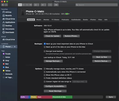
Settings became much simpler, too
You see clear reports on what podcasts you rented and when, and keep all the subscriptions and downloads in check on a single tab.
The disadvantages of new applications
Now that we’ve been through the good aspects of new applications, it’s time to talk about the bad and the ugly. As with any new update, it will take a lot of time till the new solutions will fully catch up in terms of functionality and rich user experiences to iTunes.- Embrace bugs. If you have spent a lot of efforts to make order in your iTunes playlist, you will perhaps be badly surprised. Some settings have entirely disappeared from Apple Music, and now your playlists will look different from what they have used to be. You’ll have to reorganize the audio files from scratch to adapt it to the new functionality.
- You’ll have to switch between three different apps regularly. If on iTunes all features were available in a single window, here you’ll have to change tabs and get used to three, although similar, but still different interfaces.
- There is no conclusive data on the synchronization between new apps. How will three solutions interact with each other? That remains a question. In iTunes, synchronization was the crucial part of user experience, and keeping it this way in new tools is essential. Well, we’ll see more on that once the official version is released.

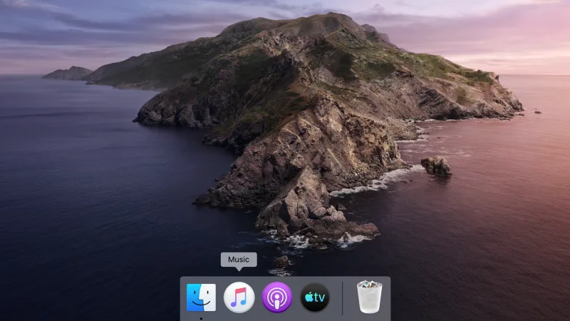
New apps also occupy more space on the panel
The final verdict
Overall, new apps solve all the main issues that iTunes has been struggling with lately. By splitting functionality into three pieces, the developers have achieved their primary goal - reducing the tool’s complexity and decluttered the interface. Now, instead of one monolith app, we have three small services, dedicated to smaller tasks.However, dismissing iTunes as outdated or problematic is just wrong. For one thing, having all features available in one app is more comfortable than having to switch from one solution to another constantly. Also, so far, new apps don’t offer quite similarly rich user experiences. While simplicity is faster and more comfortable, complexity provided more options.
Luckily, the old platform is still available for Windows. If you feel nostalgic about the old platform, you can get the old feel on the Windows PC.
Let’s hope that developers, caught up in new apps, won’t abandon the Windows version. It would be a shame, considering that its recent updates were truly decent. In any case, old iTunes remains quite relevant, and new apps show a lot of promise. We’d say this is all good news.

